The packaging design trends for 2023 reflect a mixed bag of reactions to the current state of affairs: rising inflation, global wars and the climate crisis. From cutesy escapism to nostalgia, design aesthetics for packaging depict optimism and enthusiasm with lots of bright colors and fun imagery, as well as leaning on comfort in the familiar.
And while there’s a wide variety of tastes, one thing for sure is that these packaging design trends are shaping up to be a playful, bright and fun bunch.
10 best packaging design trends for 2023
—
- Illustrated ingredients in punchy palettes
- Tactile texture
- Wrap-around patterns
- Typographic scrawl
- Mascot variations that tie products together
- Ecstatic colors
- Cartoon charm
- Product visuals with a creative twist
- Sticker book aesthetic
- ’70s vintage
1. Illustrated ingredients in punchy palettes
—
Reflecting the greater cultural appreciation of transparency, especially when it comes to what we put in our bodies, one of our favorite packaging design trends of 2023 is decorating packaging with ingredients that are illustrated in a bright and fun style. Not only does it get the attention of people who want to know the ingredients in the product, but it can also differentiate which flavor or variation a particular product is.


The visuals in this trend lean toward the cartoonish and youthful as a means to bring back childhood memories and give a wholesome energy. The illustrated ingredients rely on fresh, juicy pops of colors and less refined art styles, such as doodles, to make the product on the packaging more appealing and fun.


This bold, colorful trend not only helps brands stand out amongst competitors but is also a quick signifier of what the product is to a consumer. Two key goals of any packaging design.

2. Tactile texture
—
As brands look for ways to make their packaging stand out, they’re discovering the advantages of tactile textures. We’re seeing a rise in techniques that add texture to packaging like embossing and debossing (where the packaging is raised or depressed), die-cuts (creating artistic holes in the packaging) and foil printing (using reflective metal on packaging).


Labels and packaging that use these printing techniques always bump up the perceived value of the product, as they look pretty darn fancy and are often associated with high-end brands.
As much of our lives move toward the digital landscape, this packaging design trend grounds us with our sense of touch. And there’s something to be said for how a package feels with special textures, appealing to more senses than just sight.
Adding something special in the printing process brings a point of focus to the viewer. It looks high-end and extra.


3. Wrap-around patterns
—
Wrap-around patterns use eye-pleasing and seamless wide lines to generate curiosity and encourage people to pick up the product. These visual elements go beyond design that’s only for the front of the packaging, favoring a desire for freedom and going against the norm.


Using wrap-around patterns that cover all sides of the packaging invites us to pick up and explore the product. It catches our attention, especially if the patterns line up when displayed on the shelves. The appeal of this packaging trend lies in consistency with patterns and the fluid nature of design.


4. Typographic scrawl
—
Typography on packaging goes through its own trends, and lately, the rise in handwritten or “scrawled” text is unmistakable. Aesthetically, this trend takes us back to basics with the look of a permanent marker, complete with streaks and uneven coloring, as if someone simply wrote the product’s name effortlessly on the can or box.

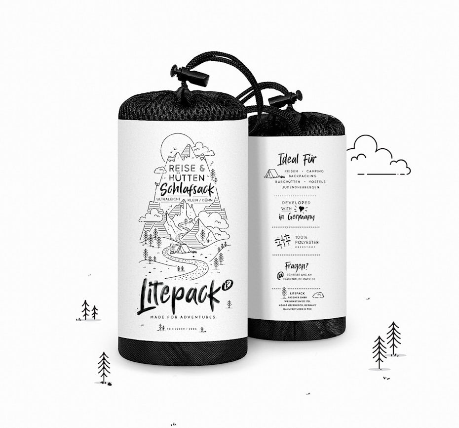
The visuals give off a casual and personal DIY look that’s a contrast to the more polished, not-a-hair-out-of-place brands. Instead, these designs are more authentic and appeal to our light-hearted side. And for many, this softer response to the current times can help ground us in all the chaos.
This is an easy design trick to immediately make a product have soul, appear homemade and feel down to earth.


5. Mascot variations that tie products together
—
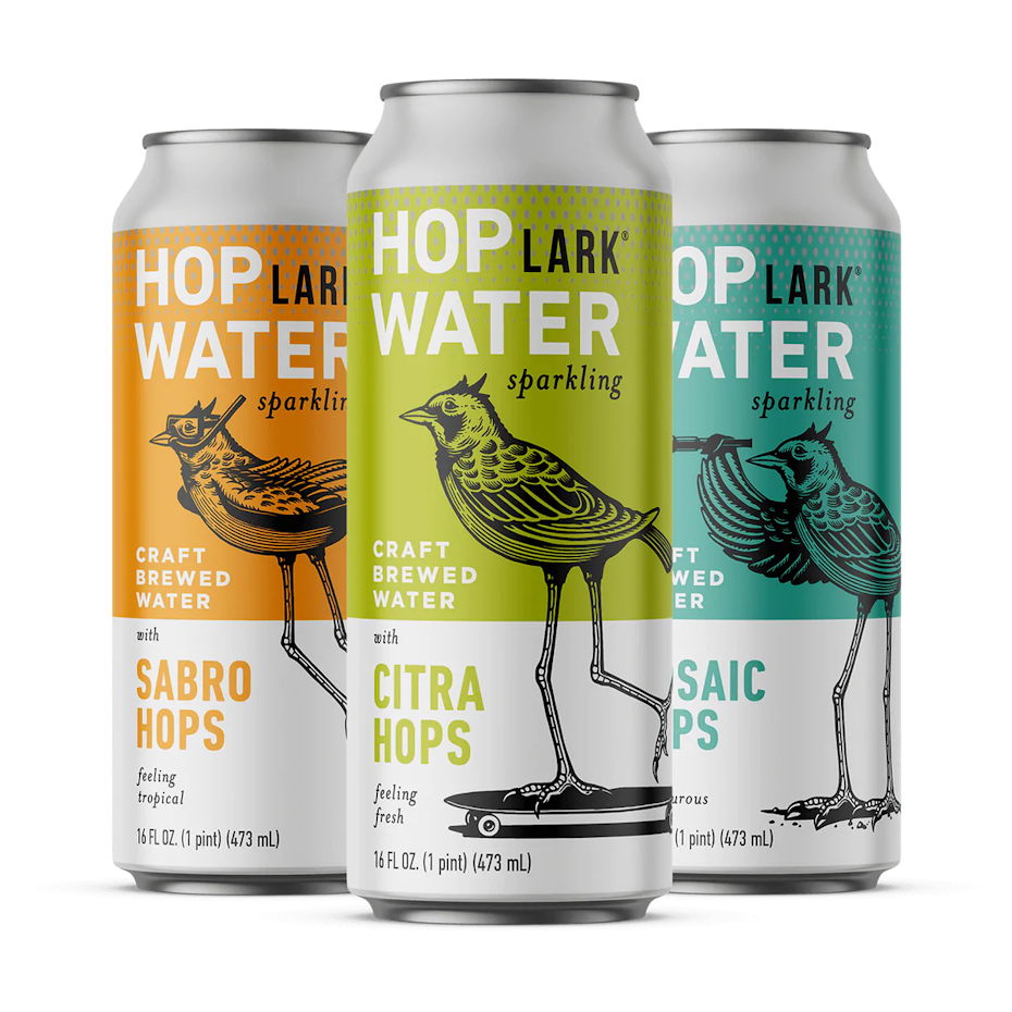
Traditionally, mascots remained more or less the same; they wore the same clothes and had a consistent disposition. All that’s changing, as brands are adding variation to their mascot’s appearance between product types and flavors, with new clothes, movements or attitudes.


These subtle mascot variations mostly include new outfits or activities. The change adds a playful and quirky touch that doesn’t sacrifice cohesion. It’s an ideal way to tie together an entire product line while simultaneously endearing shoppers.


6. Ecstatic colors
—
Flashier, brighter colors get attention. It’s as simple as that. That’s why in 2023, ecstatic colors are trending in packaging design. Ecstatic colors set aside formality, and are a smart move for getting your packaging noticed.


With our visual attention more valuable than ever, being bold, bright and ecstatic is taking over.
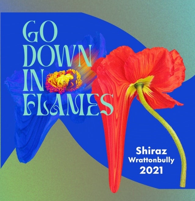
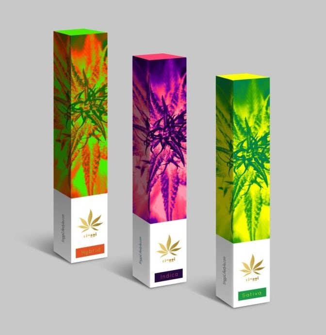
Because ecstatic colors are bold, highly saturated and bright hues, they create a confident, fearless impression. But even more beneficial is how playful or even whimsical these colors can be. They can give us a glimmer of hope and playfulness as we look ahead.


It’s all about highly saturated colors, textures, a real sense of playfulness and bold gestures. We’ve always been fans of bold aesthetics and personalities, so it’s a trend we’ll definitely be embracing!

7. Cartoon charm
—
There’s always been a special charm to cartoons. Something about the cute aesthetics and the wacky situations they can be drawn in gives cartoons a fun, fantasy feeling, reminiscent of childhood. Putting those cartoons on your packaging not only brings that charm front and center, but it can also strengthen a brand’s personality.
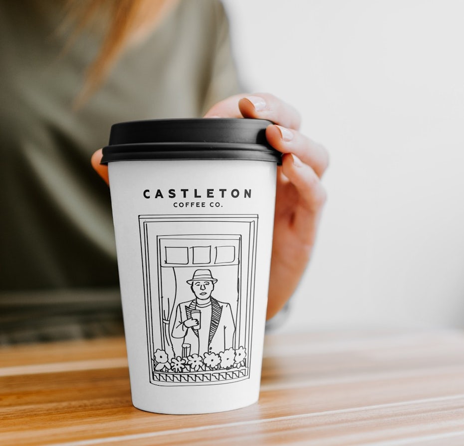

Loving the minimal and imperfect hand-drawn strokes.
In 2023, cartoons on packaging lean toward a classic, minimal style, similar to the comics from newspapers. They look as though they’ve been hand-drawn quickly and effortlessly. And unlike the more polished cartoons in film and TV, the hand-drawn strokes in these cartoons have a little wobble to them and embrace imperfections. All of which add to the overall silly and goofy charm of cartoons.


8. Product visuals with a creative twist
—
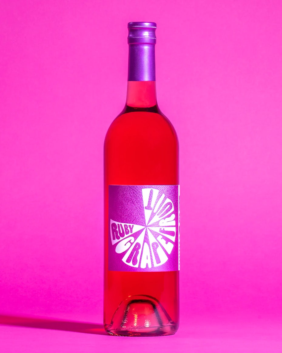
Product visuals are a staple in packaging design, useful for giving an idea of what’s in the package itself. But in 2023, product visuals are getting loose in their presentation through abstract, geometric and simple shapes.


The idea here is that the visuals on the packaging allude to what’s inside rather than simply placing the product on the packaging. Using loose or abstract interpretations of the product plays with our expectations and leans into our freedom to express. The results are some new stand-out product designs with a creative twist.


![Packing design trends 2023 example: Simple Wines]](http://99designs-blog.imgix.net/blog/wp-content/uploads/2022/11/attachment_132717246-scaled-e1667906856910.jpeg?auto=format&q=60&fit=max&w=930)
9. Sticker book aesthetic
—
Who doesn’t love stickers? The packaging trend of using stickers book aesthetics appeals to our inner child, especially those nostalgic for the 90s.


These designs use bright colors and are often identified by spacing certain images (especially cute icons or illustrated doodles) apart from others or even overlapping them. This floating style of composition replicates a sticker book, where stickers were often placed randomly and haphazardly, giving it a carefree, irreverent energy.
Like the other trends that lean on nostalgia, stickers appeal to happier and simpler times, adding both fun and a little escapism from the current state of the world.


I’m in love with the use of stickers in packaging and branding. It gives identity and curiosity to the packaging. And anyone who looks at the packaging will be very interested to see what’s inside. Stickers have the ability to make people laugh and they are just magically fun!

10. ’70s vintage
—
The ’70s vintage style never goes completely out of fashion—it just hibernates for a few years. And in the pandemic aftermath, the warm color schemes and comforting, wavy imagery of the ’70s are making an understandable comeback from home decor to fashion, and even packaging design trends.

Aesthetically, the ’70s vintage style draws on earthy color schemes, especially in hues of browns and oranges, bubbly serif fonts and thick, squiggly patterns. This design trend evokes breezy familiarity and groovy individualism.
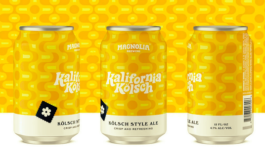

It’s time to relax. The ’70s aesthetic reflects our want for calm, cool colors and a simpler time, which has leapt to packaging design to let people know that the product they are looking at is approachable and familiar.

Ready for the biggest packaging design trends in 2023?
—
If there’s one thing we can surmise from the latest packaging design trends, it’s that they’re a response to and reflection of the times. With all the uncertainty and unrest of this past year, people are responding to positive and familiar styles in packaging design, whether for escapism, for reminiscing of the past or for finding hope in the future.
The post 10 best packaging design trends for 2023 appeared first on 99designs.